Media Report
Teen Thriller Films
Jodie Kirk
The thriller genre can be defined as ‘extraordinary events happening to ordinary people’ which allows the audience to escape reality while watching a thriller film. They are also characterised by the moods they give out and heightened feelings of suspense, excitement, surprise, anticipation and anxiety. However, most thriller films have sub genres such as thriller horror or thriller comedy which also broadens out the target audience for individual films.
Thrillers in general tend to be fast paced, full of suspense pauses, tense and mysterious. This can lead to a dramatic climax and give a greater understanding of the film.
Teenagers are considered to be the largest consumer demographic as they can access all types of news and information through many different platforms. They can influence their friends and other people that they know, to go watch or take part in something. Teenagers want to see advertising that is eye catching and interesting otherwise they will not pay attention to it. Ways to advertise towards a teenage audience can include youtube videos and also advertisements on platforms such as Instagram and Snapchat. Teenagers generally pay attention and like things that they can relate to. For a film, teenagers watch movies that involves people of a similar age or an 'idol' that they look up to e.g. rappers. Examples of teen thriller films include ‘Final Destination’, ‘When a Stranger Calls’ and ‘Divergent’.
While researching different thrillers, I found out that there are a lot of similar themes that come up in trailers and posters. Most of the trailers I watched had blackouts or fades which suggests that they essential for a thriller trailer. This may be because they add suspense to the film which engages the audience, or it could be used as a cliff hanger. All of the trailers had intense or eerie music which adds tension, leading up to the idea that something bad and shocking is going to happen. This is typical for a trailer as it gradually builds up interest in the film. There were also a lot of scenes with low lighting which adds a sense of mystery and also 'the unknown', which intrigues the audience.

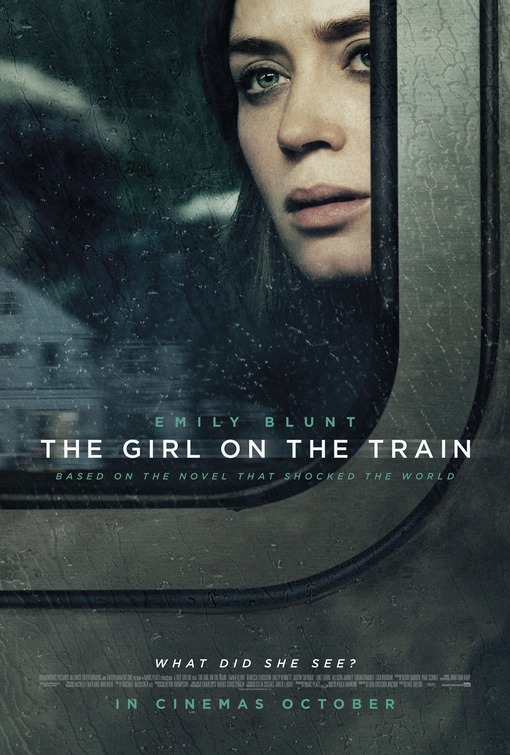
Both of these two thriller posters have low lighting and darker areas which suggests evil or mystery. The font is simple however they both have added a twist to the main title on the poster. 'The Gift' has a cut or a slit in its title which creates suspense and an urge to know what will happen. 'The Girl on The Train' is slightly blurred which can make the views wonder why it has been printed like that. It could suggest and illusion or a blurred mind which will make the audience interested into finding out more.
The general codes and conventions of a thriller film trailer:
- Tend to have a 3 act structure
- Long shots at the start to establish character
- Sound effects to build tension
- Short shots / quick cuts to make excitement
- Music building to a crescendo
The posters seemed to have a dark colour scheme which connotes evil and possibly mystery. There were unknown characters or figures which creates a sense of the unknown and endless possibilities. These are common features of thriller film advertisement.
Other common features are:
- Actors name
- Tag line
- Main image
- Title block
- Release date
- Billings block
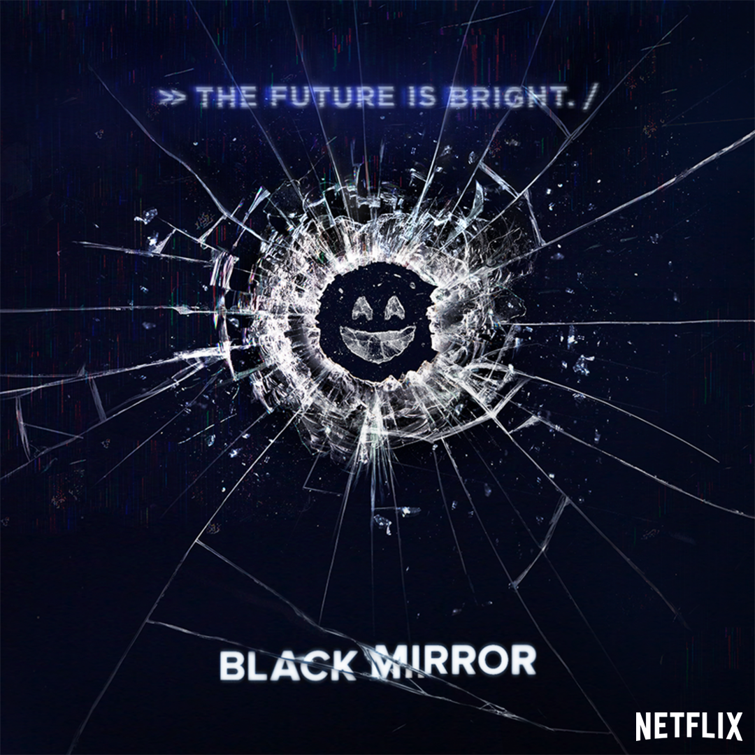
For part of my production I had to create a storyboard or a script. To do this I had to look at a range of trailers, films and TV series to get an idea of what my story line will be. One of the series I watched was Black Mirror. Black Mirror is a Science Fiction genre series created in 2011 however, it had elements of thriller films which is where I got my idea from. There was a lot of anticipation, suspense and plot twists and it allowed you to escape reality while watching it which is what thrillers typically do and it is what teenagers are interested in.

Although my script and storyboard has predominantly female characters, I think my target audience has been identified well because female teenagers would watch this as it may apply to them and they like to see people similar to them and male teenagers would watch this as it involves girls and a party which is what they are interested in.
Although my script and storyboard has predominantly female characters, I think my target audience has been identified well because female teenagers would watch this as it may apply to them and they like to see people similar to them and male teenagers would watch this as it involves girls and a party which is what they are interested in.
For my production I created a DVD cover and a poster on photoshop. This creates three pages of coursework. I found a poster that I tried to re-create but also change it so it looks different.
 |
| My Poster |
 |
| Movie Poster I Found |
Strengths of my poster is that it has an eye catching format which will engage my target audience and it fits in well with my storyline. The tagline is intriguing and causes mystery which is what you tend to find in thriller films. Teenagers are also mainly interested in people their age and would watch something that involves people their age which is why I chose to use a 17 year old girl as the main image which people may be able to relate to. However, I had difficulties creating this poster as it was looking more like a horror film rather than a thriller. The effect on my poster relates to my tagline of 'reality is just an illusion' as the main image is semi blurred but also slightly red. I used a lot of black on this poster as black connotes danger and mystery. I used a lighter grey background behind the main image to show she is in front of the light, not walking towards it suggesting that something bad has happened to her. I also have an age rating of 15 which clearly tells that the intended audience is teenagers.
The weaknesses of my poster is that you cannot guess the specific story of what this film is about. People could interpret it in different ways which may then possibly lead to them researching the film. The colour scheme is fairly dull which may not interest the audience however the slight tinge of red adds a mysterious effect. As this poster does not have any dates or credits on it, the audience will not know when this film will be released but on all theatrical posters I looked at, they had limited information about the film.
 |
| A Theatrical Poster |
 |
| A Theatrical Poster |
This was my original poster idea.

This poster was supposed to be in a photo booth style going from the beginning where both sisters are alive to where one is on her own to then the other sister coming bucket haunt her. At first I thought this was a good idea and the style of the poster was something teenagers would be interested however the story I was trying to tell was not coming through. There is a mixture of bright and dark colours which could me mistaken as not to be a thriller film.
This is my DVD cover.
 |
| Front Cover |
 |
| Back Cover |
Strengths of my DVD cover is that it has the same types of images that there are on real ones. It has the barcode and companies that produced the film. It was important to put these on as otherwise it wouldn't look real. The front cover would draw attention to the DVD cover as people would find it interesting to look at and see what it is about. The picture is also similar to the one on my poster so for people who had seen the poster, they would know what the DVD is about if they saw it on a shelf.
Weaknesses of my DVD cover is that the pictures on the back don't show much of the story seeing as all the pictures were taken in the same area therefore making it unrealistic.
No comments:
Post a Comment